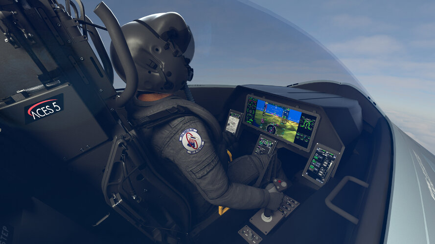
The rest of the cockpit is beautiful to look at – nothing analogue, all digital with about 10 actual switches in the cockpit. Notice I say beautiful to look at, not necessarily beautiful to interact with! In theory the all-glass display is great. It’s touchscreen, you can set it up to show pretty much anything you want in any layout you want. Take, for example, a fuel display. You can have it in a large window that shows you everything you could possibly want to know about the aircraft’s fuel system; the contents of each tank, which pumps are operating, fuel temperature, centre of gravity etc. Or you can shrink it into a smaller window that only shows more basic info. Or you don’t even display it at all because the Function Access Buttons (FAB) along the top of the display always has a small fuel section with the essential info visible at all times. That’s the beauty of the display – size and customisation. The drawback is in the complete lack of tactile response. It can be challenging to press the correct ‘button’ on the display whenever the jet is in motion as it is quite a bumpy ride at times. At present I am pressing the wrong part of the screen about 20% of the time in flight due to either mis-identification, or more commonly by my finger getting jostled around in turbulence or under G.

nationalinterest.org


