pedrospe
ACCESS: Secret
- Joined
- 9 February 2010
- Messages
- 395
- Reaction score
- 215
Another absolutely gorgeous project CiTrus, any more views??
Another absolutely gorgeous project CiTrus, any more views??
Just beautiful, thank youThanks!Another absolutely gorgeous project CiTrus, any more views??
Here they are:
View attachment 684532
View attachment 684533
View attachment 684534
Some of the details and views are speculative, unfortunately, since the available drawing lacks a front view (and also, the side and top views are very small).
I love it Citrus, another beautiful workMcdonnell Douglas Concept 2406
View attachment 685626
And ortho views:
View attachment 685627
View attachment 685628
View attachment 685629
Beautiful artwork citrus! this is one of my favorite black projects, nice start for 2023, hope you get well soonFirst one for 2023, while homebound trying to recover from covid...
Northrop Grumman Switchblade
View attachment 690679
Hi Baroba! I wanted to do a dusk/dawn shot, so with a darker background while the aircraft at altitude is still partially illuminated by the sun.Hi Luca,
I saw your render of the Northrop Grumman Switchblade, nice model, but the render does not do wonders to show the model...
I did some edits on your render and have made 2 variants of it.
I think you wanted to do a nighttime shot?
But it also could have been a dayrender with a bad colorspace
My advise is to push the colors a bit more, to make the whole image pop.
A nice comparison would be your Lockheed Martin VS-07:
https://www.secretprojects.co.uk/attachments/vs-07-9a-small-jpg.686489/
And mine:
https://www.aerospaceprojectsreview.com/usbp19cover.jpg
Feel free to contact me if you need any assistance
Just offering some help.
Best regards,
Rob
 www.facebook.com
 www.facebook.com
Dusk/dawn shots are completely different in regards to colors ( usually called golden hours, because of the lightcolor)Hi Baroba! I wanted to do a dusk/dawn shot, so with a darker background while the aircraft at altitude is still partially illuminated by the sun.Hi Luca,
I saw your render of the Northrop Grumman Switchblade, nice model, but the render does not do wonders to show the model...
I did some edits on your render and have made 2 variants of it.
I think you wanted to do a nighttime shot?
But it also could have been a dayrender with a bad colorspace
My advise is to push the colors a bit more, to make the whole image pop.
A nice comparison would be your Lockheed Martin VS-07:
https://www.secretprojects.co.uk/attachments/vs-07-9a-small-jpg.686489/
And mine:
https://www.aerospaceprojectsreview.com/usbp19cover.jpg
Feel free to contact me if you need any assistance
Just offering some help.
Best regards,
Rob
I'm certainly biased, but your edits seem a bit too extreme with the contrast and color saturation. But I admit that may be just a matter of personal preferences and people might prefer your edits to my original.
What (I think) I really struggle with is texturing (creating all the different texture maps) and photo bashing (mostly).
I'd love to be able to make a cohesive picture that pops out, but I think it's more of a matter of lightning than the use of colors?
For example, a couple of artists whose works I really love are Antonis Karidis and Ronnie Olsthoorn and they don't necessarily always push the contrast and saturation too much, yet their pictures feel "vivid" through the use of light.
A couple of examples of what I mean:
Log into Facebook
Log into Facebook to start sharing and connecting with your friends, family, and people you know.www.facebook.com
Log into Facebook
Log into Facebook to start sharing and connecting with your friends, family, and people you know.www.facebook.com
At least that's where I feel I'm really limited at the moment. I can do textures and I can do photo bashing (both not very well), but putting them together to obtain a "realistic" feel (which mind you, for me doesn't mean doing something in a photorealistic way but rather in the ability to convey a feeling), is something I'm unable to do.
Inspired by you, made by CAO 700Found this lovely drawing posted by Deltafan some months ago and then realized I had yet to tackle a Payen aircraft so far!
So here we go, Payen RP420 or K28B:
View attachment 660623
Ah, looks like Sneaky Pete.
Oooh, I see now.This is Boeing design.
Excellent. That takes me back several decades
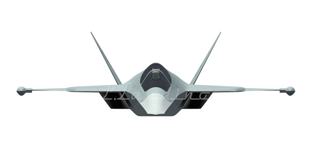
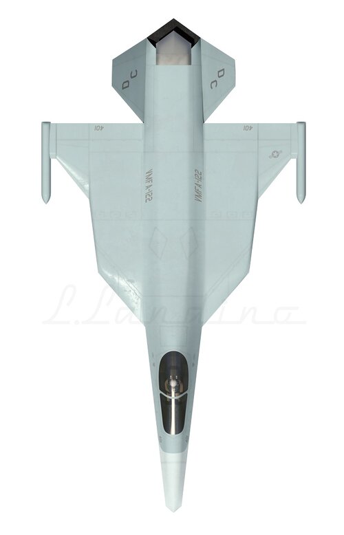
Wahoo, could you show more of this aircraft ?Northrop AC-WTF STOVL
View attachment 699818
Wahoo, could you show more of this aircraft ?


woo, so beautiful, i love itWahoo, could you show more of this aircraft ?
Here we go:
View attachment 699837
View attachment 699838
View attachment 699839
Accuracy might leave a lot to be desired, but I had to "make do" with a screenshot from Youtube of Tony Chong's presentation of his Flying Wings and Radical Things (here part 1 and part 2, the project in question is on screen at minute 54:34).
“We ran out of metal for the wings, so..”Wahoo, could you show more of this aircraft ?
Here we go:
View attachment 699837
View attachment 699838
View attachment 699839
Its a typo in the presentation - this is a design from 1989 AC/WFT studies (Aero Configuration / Weapons Fighter Technology) and is illustrated on P244 of Tony's Flying Wings and Radical Things book.The panel behind the canopy is for a lift jet intake while the main engines had extra inlet doors (the diamond shapes on top) and separate vertical exhausts at the rear for vertical flight mode.Wahoo, could you show more of this aircraft ?
Here we go:
View attachment 699837
View attachment 699838
View attachment 699839
Accuracy might leave a lot to be desired, but I had to "make do" with a screenshot from Youtube of Tony Chong's presentation of his Flying Wings and Radical Things (here part 1 and part 2, the project in question is on screen at minute 54:34).
Its a typo in the presentation - this is a design from 1989 AC/WFT studies (Aero Configuration / Weapons Fighter Technology) and is illustrated on P244 of Tony's Flying Wings and Radical Things book.The panel behind the canopy is for a lift jet intake while the main engines had extra inlet doors (the diamond shapes on top) and separate vertical exhausts at the rear for vertical flight mode.
STOVLIf I understood correctly, then this project was a VTOL ?
