Most modern combat (designed) rotorcraft have ballistic resistant flight controls and a significant level of redundancy. Many have at least dual hydraulic systems. Some have back up control systems as well.
We rarely read about the shot up helicopter that got back as it is not news worthy. I am reminded of the CV-22 that was hit ~ 20 times by 7.62 and 12.7 fire, flew ~400 miles plugged into an MC-130 because it had bullet holes in the gas tanks.
 
Most modern combat (designed) rotorcraft have ballistic resistant flight controls and a significant level of redundancy. Many have at least dual hydraulic systems. Some have back up control systems as well.
Right. Flight controls, not so much the flight instruments.


We rarely read about the shot up helicopter that got back as it is not news worthy. I am reminded of the CV-22 that was hit ~ 20 times by 7.62 and 12.7 fire, flew ~400 miles plugged into an MC-130 because it had bullet holes in the gas tanks.
Wonder how long it took the pilots to extract the pilot's seat cushions from their posteriors after that?

Not the getting shot at part. The "400 miles plugged into an MC-130" part!
 
Right. Flight controls, not so much the flight instruments.


Wonder how long it took the pilots to extract the pilot's seat cushions from their posteriors after that?

Not the getting shot at part. The "400 miles plugged into an MC-130" part!

It wasn't quite like that. They tanked twice in 400 miles. But the first time they took the full capacity of the aircraft in one plug. Then had to do it again just to get to Entebbe. Manually cranking out the probe because the hydraulics were completely empty.

 
Hmm isn't the Valor slated to get the Electro Hydraulic systems like the F35?

Which do away with the hydro lines for date cables running pumps at tge pistons themselves which cuts tge weight in half.

And makes everything more robust since laying data and power cables are easier then high pressure hoses...
 
Last edited:
Hmm isn't the Valor slated to get the Electro Hydraulic systems like the F35?

Which do away with the hydro lines for date cables running pumps at tge pistons themselves which cuts tge weight in half.

And makes everything more robust since laying data and power cables are easier then high pressure hoses...
Sure hope you are right!
 
Yep.


Across all of the vehicles with touchscreen infotainment systems tested, it took drivers an average of 24.7 seconds to perform all of the tasks required of them, nearly 2.5 times longer than it did with the screenless system. That may be the most important task vehicle designers have before them now.

In addition, they had to take their eyes of the road to do it.

The gap may be narrowed with decent ergonomics, which has definitely gone backwards in cars over the last few decades (just compare a BMW or Mercedes of the 80s with one today). However, that's still a huge gap when every fraction of a second of reaction time matters.

Below: one's an instrument and control system and the other's a disco.
 

Attachments

  • Mercedes-Benz-S-Class_W126_1979_1600x1200_wallpaper_08.jpg
    Mercedes-Benz-S-Class_W126_1979_1600x1200_wallpaper_08.jpg
    308.8 KB · Views: 231
  • 2022-mercedes-benz-eqs-interior 20.jpeg
    2022-mercedes-benz-eqs-interior 20.jpeg
    76.6 KB · Views: 97
Yep.


Across all of the vehicles with touchscreen infotainment systems tested, it took drivers an average of 24.7 seconds to perform all of the tasks required of them, nearly 2.5 times longer than it did with the screenless system. That may be the most important task vehicle designers have before them now.

In addition, they had to take their eyes of the road to do it.

The gap may be narrowed with decent ergonomics, which has definitely gone backwards in cars over the last few decades (just compare a BMW or Mercedes of the 80s with one today). However, that's still a huge gap when every fraction of a second of reaction time matters.

Below: one's an instrument and control system and the other's a disco.

Muscle memory when it comes to being able to instinctively hit buttons, flip switches is a thing. Every time I see that they're putting a touch screen system into a new platform, I think of myself poking and prodding at the screen on my car. I swear they reverted a number of the touch screens on the Navies LCS boats, but I couldn't find the articles to confirm that.. But they did do it on the Burkes apparently. https://news.usni.org/2019/08/09/na...tles-after-fleet-rejects-touchscreen-controls
 
Muscle memory when it comes to being able to instinctively hit buttons, flip switches is a thing. Every time I see that they're putting a touch screen system into a new platform, I think of myself poking and prodding at the screen on my car. I swear they reverted a number of the touch screens on the Navies LCS boats, but I couldn't find the articles to confirm that.. But they did do it on the Burkes apparently. https://news.usni.org/2019/08/09/na...tles-after-fleet-rejects-touchscreen-controls
Know that the Burke revision happened after tge Fitzgerald and Mccain crashes.

Apparently the helmsman try to exercise his right to ignore the officer to avoid the crash on one of them. While the other deck officer did everything right.

But neither couldn get the engines and props to what he needed them to avoid the big old tanker due to the touchscreen. And considering how agile a gas turbine with adjustable propers ship are...

You see the issue
 
The upfront dash isn't the only place that physical switchery can be mounted. I would expect HOTAS systems for the majority of the human-machine interface, plus probably a throttle quadrant/center horizontal panel and overhead banks of key levers and switches and fire extinguisher handles.

Screen durability isn't likely to be a problem...consumer grade phone screens (and not for the cheapass ones you get if you walk into Verizon and gripe "I just need a phone") are *ridiculously* durable, and if the military-grade display isn't specced at least to the same degree, I'd be surprised. Integrate flexible ballistic shielding around the flight control area, and it probably actually becomes a very functional work environment for those who train for it.

And that's the difference. The people who complain about touchscreen interfaces in vehicles are also the ones who aren't just getting on with the practice of learning them. The pilots who'll be entering the training system when the Valors come online will most likely not be stubborn about how to use them.
 
Well it is illegal in most states in the US to text or manipulate cell phones while driving because you have to look inside. Yes, you can ask Ciri/Google to dial for you but if you are driving down the street at 100 miles an hour avoiding randomly parked cars with people throwing rocks at you, looking inside the car may be very risky. Metaphorically speaking. I am sure that the technology will be improved to a point somewhere in the future but comparing an F-35 at FL35 doing BVR and a FLRAA flying in a hostile environment at FL.01 are very different.
 
And that's the difference. The people who complain about touchscreen interfaces in vehicles are also the ones who aren't just getting on with the practice of learning them.

Because you can't "learn" them. Touchscreens require focus and attention. Tactile responses and muscle memory are not possible. They're not reliable in terms of MBTF compared to a button, switch, or knob. etc. The only benefits touchscreens have is they were in Star Trek back in the '80's and they're cheap.

It's a great decline in the general human factors of a combat system when it relies on touchscreens instead of tactile MFDs.

At the end of the day you will need a touchscreen operator and a pilot, instead of just a pilot, to fly the aircraft.
 
Yes this is my anecdotal experience.

My car was apparently sandwiched between all button and the total touchscreen trends (meaning I have a touchscreen but mostly still buttons and switches) I can easily use any switch or button while never taking my eyes off the road while I’ve never not had to look at the screen to see if I pressed in the right spot.
 
Because you can't "learn" them. Touchscreens require focus and attention. Tactile responses and muscle memory are not possible.
Not entirely true.

My last phone used a different user interface for the alarms than my new one does. Old phone was "grab at one end, swipe right to snooze". New phone is "grab at one end and swipe either direction to turn OFF" and I keep getting tripped up by that. Snoozing the new phone is a small virtual button at the center of one end and is a simple push.

I meant being able to do it without looking, tbf.

Touch typing is impossible with a touchscreen or holographic/projection keyboard.

That, and touchscreens are often less reliable than tactile buttons. An MFD can probably be learned by touch alone, as can a HOTAS, but it has similar issues to learning a touchscreen where functions are nested inside each other. The difference is I know definitively I'm pressing the button third down on the right and second from the left on top to switch from a moving map to digital stores.

When you put touchscreen controls into fighting machines, people literally get killed.
 
I meant being able to do it without looking, tbf.
I'm not looking at my phone when I'm dealing with the alarm.


Touch typing is impossible with a touchscreen or holographic/projection keyboard.

That, and touchscreens are often less reliable than tactile buttons. An MFD can probably be learned by touch alone, as can a HOTAS, but it has similar issues to learning a touchscreen where functions are nested inside each other. The difference is I know definitively I'm pressing the button third down on the right and second from the left on top to switch from a moving map to digital stores.

When you put touchscreen controls into fighting machines, people literally get killed.
exactly.
 
Know that the Burke revision happened after tge Fitzgerald and Mccain crashes.

Apparently the helmsman try to exercise his right to ignore the officer to avoid the crash on one of them. While the other deck officer did everything right.

But neither couldn get the engines and props to what he needed them to avoid the big old tanker due to the touchscreen. And considering how agile a gas turbine with adjustable propers ship are...

This is not an accurate representation of the McCain crash. The reason why it crashed was that literally no-one on the bridge knew how the controls worked, and if they had had physical controls instead of a touch screen, it wouldn't necessarily have helped, because the actual problem was that they moved control of the ship to a station that no-one was using at the time.

This is the NTSB Marine Accident Report.

The cliff notes version is:

The sleep-deprived crew who hardly understood how half the functions in the control software worked managed to fumble transfer of control and when they tried to split the steering and throttle controls to different consoles by sending throttle control to the lee helm, they sent steering there too. Then the rest of the accident was a comedy of errors as the bridge crew and the crew alerted to go the aft steering compartment tried to regain control of steering in a situation where no-one actually understood what each control change actually did, and as multiple groups of people were working it at the same time, they managed to stumble on each other's toes and nullify their efforts.

The crowning jewel of it all that on the main helm station there was a big red button, that the crew actually called the big red button, which was meant for just this kind of situation, that immediately switched control mode to backup manual and transferred control to the station with the button. (image attached)

And had the helmsman just hit it, as the proper procedure required him to do, everything would have immediately been fine.

However, not only did no-one on the bridge actually understood what the button did, they had multiple conflicting ideas of what it did. The helmsman (and most of the rest of the bridge crew) thought it would actually transfer control to the aft steering, therefore taking controls away from him, so he didn't want to hit it. The OOD thought that the button did nothing to transfer controls, only changing the control mode to backup manual, which it was already supposed to be in, so hitting the button wouldn't do anything so he didn't order anyone to hit it.

So no-one hit it. That is, no-one punched it until they decided they wanted to transfer control to the aft steering, at which point when the aft steering acquired control, the button was pressed, taking it away from them. To the station that no-one on the bridge thought was going to be in control.

The crew managed to spend the rest of their time bouncing control between the ends of the ship with no-one actually managing to steer it until the bulbous bow of the tanker punched a hole in the side.
 

Attachments

  • bigredbutton.png
    bigredbutton.png
    79 KB · Views: 109
How the hell did they get command of a ship?
I thought they were tested to the breakingpoint? Now it sounds like a bunch of sailors were lifted from their bunkbeds and dumped onto the bridge trying to figure out how to sail a ship, with only Klingon on the displays....
 
How the hell did they get command of a ship?
I thought they were tested to the breakingpoint? Now it sounds like a bunch of sailors were lifted from their bunkbeds and dumped onto the bridge trying to figure out how to sail a ship, with only Klingon on the displays....
By not having enough crew who got their Surface Warfare quals on THAT SHIP in the crew, because all the ships were painfully short-handed due to lack of recruiting they were sending people from one ship to another of the same class; but because there aren't enough ships for all the taskings, refits to get all the ships on the same damn version of the control systems were getting cut short so no two ships had exactly the same controls like the people assigning bodies assumed.

The NAVSEA 08 report was damning. Yes, they sent Naval Freaking Reactors Himself out to be the major investigator to dig down to the root causes.

Much egg on face for Big Navy ensued.
 
While doing my usual Saturday AM internet stroll, I came across the attached briefing. It is interesting and would likely have been a great presentation to hear. Still don't agree, but I am posting for consideration.
 

Attachments

  • 19 Chavez SAE Advanced Cockpit Brief - DRAFT-REV E(approved images).pdf
    4.4 MB · Views: 46
While doing my usual Saturday AM internet stroll, I came across the attached briefing. It is interesting and would likely have been a great presentation to hear. Still don't agree, but I am posting for consideration.
Still needs manual buttons, but those may be on the HOTAS.
 
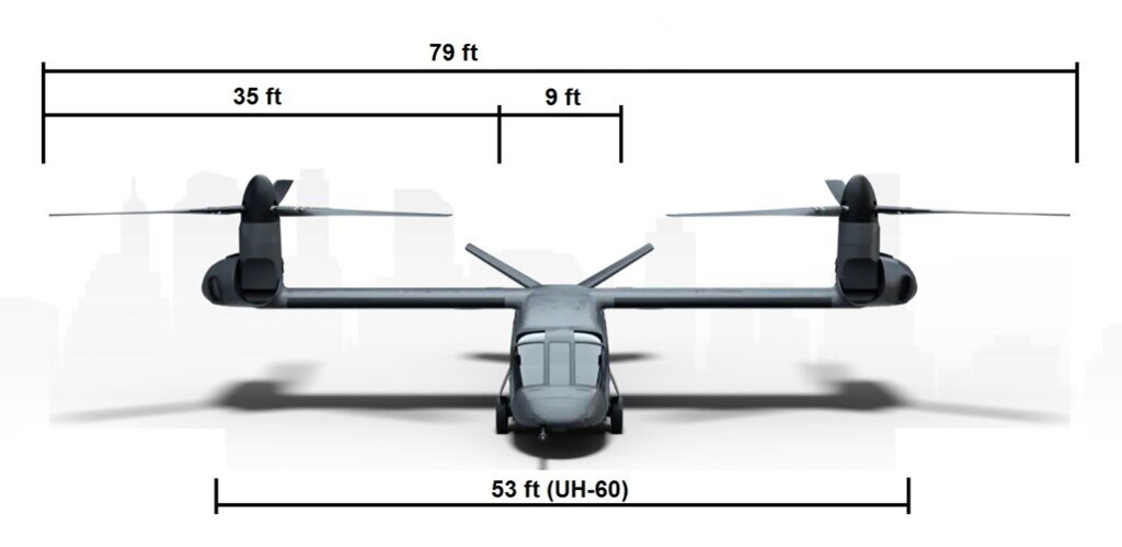
Hi, I don't know whether this is the right place to post this, but I'm trying to find some info on the 280's wings. Are there any good estimates on wingspan and chord length (or aspect ratio)? All the figures online seem to vary quite drastically
 
Still needs manual buttons, but those may be on the HOTAS.
You know, how many people with touch-screen monitors at home use the feature, we all still use a mouse and we are all very quick and proficient using that mouse, I agree, some level of minimal buttons or a "mouse-type" hat switch for HOTAS.
 
I hate EFIS for that: low alt over forest and mountains on a sunny day. Now good luck to click that button at Mach 0.9 in a time sensitive manner. Unless each click zone is as big as that big screen.
 
Hi, I don't know whether this is the right place to post this, but I'm trying to find some info on the 280's wings. Are there any good estimates on wingspan and chord length (or aspect ratio)? All the figures online seem to vary quite drastically
Google sez:
v280size.jpg

The data is all from the V-280 demonstrator. So the FLRAA numbers will be different I suspect. Now that Bell Flight and the U.S. Army have to get down to haggling through the real performance and requirements the platform will change. One thing is for sure, it will not be as "swoopy" as the demonstrator. They never are. *sigh*
 
Well it is illegal in most states in the US to text or manipulate cell phones while driving because you have to look inside.
Looking inside is not the only--or even the major--problem when driving and using a telephone. Hands-free telephone conversations are, as I understand it, no less dangerous. Splitting your attention between driving and attending a meeting, arguing with a significant other, etc. is the root problem.

Humans cannot truly multitask. Like most computers, we premptively multitask, stopping one job while we cut over completely to the other and then switching back. During the switch, you aren't doing anything but switch. Switching losses degrade our performance in both tasks.

Switching over once, to press a button for example, is usually not a problem, because the amount of time away from the main task--driving--is minimal. But talking on the phone while driving requires constant switching back and forth.

Unlike buttons, touch screens are interactive. They pretty much force us to turn what was a single task--pushing a button--into a conversation, with all of the attention deficits that result from multitasking.

So why are multifunction displays now ubiquitous? It is because they are much denser information-wise and thus fit much more functionality into a given space. If you have a really complex system that provides lots and lots of rapidly changing information and lots of complex control options, the switching costs that go with choosing among all the resulting buttons and dials start to add up. Compare the cockpit and capabilities of a Century-series fighter with those of an F-16, Typhoon, or Gripen--the latter have lots more glass panels for a reason.

So there is a trade-off, as in most engineering problems. To simplify the controls and provide switches or buttons, you have to give up a lot of control over the system's capabilities. On the other hand, to provide a control for every capability, you need a multifunction interactive interface that may prove unusable when it is needed most.

I suspect that industry is no longer putting enough thought into this tradeoff. When I started in the IT industry, a lot of resources were being poured into "human factors engineering", a discipline focused on just these kinds of issues. I met some really smart people tasked with it. Unfortunately, they were always among the first to be let go when revenues slowed. Why spend money on interface improvements when you can copy what everyone else does and spend the "savings" on managerial bonuses and stock buybacks?
 
I suspect that industry is no longer putting enough thought into this tradeoff. When I started in the IT industry, a lot of resources were being poured into "human factors engineering", a discipline focused on just these kinds of issues. I met some really smart people tasked with it. Unfortunately, they were always among the first to be let go when revenues slowed. Why spend money on interface improvements when you can copy what everyone else does and spend the "savings" on managerial bonuses and stock buybacks?
They definitely aren't with cars.

My 1994 Jeep Cherokee has switch levers and a rocker switch for the HVAC controls. I can operate those controls blind.

Cars with touchscreens take 2.5x longer to do the same tasks as cars with physical buttons.

That's not acceptable (or even safe) for aircraft, when you're flying 250knots 25 feet off the ground like the V280 will be in service.
 
We are very visual creatures with amazing tactile & dexterous appendages.

Where is the best use of the visual, looking around outside while our amazing fingers can perform amazing tasks basically independently.

It would be interesting to see the brain’s electrical output differences.
 
I hate EFIS for that: low alt over forest and mountains on a sunny day. Now good luck to click that button at Mach 0.9 in a time sensitive manner. Unless each click zone is as big as that big screen.
But the funny thing is, that can be the design.

Flight-critical interactions aren't going to be on the screen, they'll be on the HOTAS/throttle/collective quadrant panels, but if you're working with a software driven interface, you are not *limited* to physical keypad-sized buttons. You can have four three-inch squares when you need four, or nine two-inch squares, etc.
They still always need to be in the same place, though.

Physical buttons around the outside of a screen? If the mode shift button I need is the 3rd one down I can keep my head up eyes outside the cockpit and feel down 3 buttons.

In all seriousness, I'd want to add some bumps to the screen, say at the corners between segments, so that I could feel down 4 bumps if that's where the virtual button always was.

And here's the funny thing...they are always in the same place in interfaces like this.

Even Apple Carplay or Android Auto, in their default states, always present the same icons in the same places. It's only when users get into customizing when things get moved around.

But I get it. My favorite car in terms of interior layout was super simple in control layout. All physical knobs on the same horizontal plane, easy to feel and recognize the state of the subsystem, etc.
 
And here's the funny thing...they are always in the same place in interfaces like this.

Even Apple Carplay or Android Auto, in their default states, always present the same icons in the same places. It's only when users get into customizing when things get moved around.
A friend of mine works in app QA. The various popups are never in quite the same places, just far enough that the automatic scripts miss whatever button they're supposed to press.


But I get it. My favorite car in terms of interior layout was super simple in control layout. All physical knobs on the same horizontal plane, easy to feel and recognize the state of the subsystem, etc.
Exactly what I'm trying to say. It's supposed to be a memorizable thing, so that when you're flying at night in blackout you can reach forward and hit the right button without taking your eyes off the view outside.
 
A friend of mine works in app QA. The various popups are never in quite the same places, just far enough that the automatic scripts miss whatever button they're supposed to press.
Heheheh, well, that's in QA. That's where that is supposed to happen so it's resolved before release to production.
 

Similar threads

Please donate to support the forum.

Back
Top Bottom