The Secret Horsepower Race by Calum Douglas (and piston engine discussion)

So the problem of de Havilland propeller hydraulics freezing at high altitude was known back in 1940/41. Combine that with a high-pressure glycol coolant system and Ouch! Several shiploads of these Spitfire Mk Vs, mostly second-hand from the European and African campaigns, were subsequently shipped out to Australia where three squadrons were formed to defend the northern areas from Japanese attacks following Pearl Harbour and a lesser-known simultaneous raid on Darwin. Many pilots and planes were lost over the Timor sea when, seeing a Jap fly past below, they opened up full throttle and dived over-hastily. The prop then failed "safe" to fine pitch. The engine immediately over-revved, sprung pressurised coolant leaks and began spewing toxic glycol fumes into the cockpit. The pilot had just seconds to bale out before being overcome. But even if you did get out in time, you landed in the middle of the Timor sea.
The Spitfires delivered to Australia, were with a few exceptions used for various trials in the U.K., brand new Mark Vc airframes (with the possible exception of a single aircraft listed in some sources as a Mk.Vb) shipped direct from U.K. MUs to Australia. They had been built from May 1942 onwards. The first batch of 6 arrived in Australia on 14 Aug 1942 with another 100 or so by the end of the year.

Details of their histories can be found here
And here

The confusion about their being used may arise from a batch of 42 “Capstans”, as they were codenamed, earmarked for Australia being diverted to the Desert Air Force in mid 1942.

54 sqn RAF and 452 and 457 RAAF left the U.K. in mid 1942. They formed No. 1 (Churchill) Wing at various bases in the Darwin Area from Feb 1943. By mid 1943 serviceability became an issue due to lack of spares and replacement aircraft. One comment from official records around this time was
“After six months tropical service, coupled with rapid climbs, the engines were fast approaching a critical period in their flying life and were passing the limit of efficiency. S/Ldr E Gibbs, 54 Squadron reported that this position assumed a serious aspect quite suddenly because of the greatly increased activity of the enemy in this sector during the past few weeks.” That was July 1943. Their was also some resentment felt amongst Wing personnel as it was felt, rightly or wrongly, that the OTU in Mildura had better aircraft than the operational squadrons.

While there were reported problems with glycol leaks a bigger cause of losses at this time was pilots running out of fuel (due to a lack of drop tanks) and use of the wrong tactics (trying to dogfight Zeroes).

Glycol problems were still being experienced in No1 Wing on Mk.VIII in Feb 1945. This extract from a book “Lions and Swans” is interesting about the glycol problems.
“The Squadron (No.54) was virtually grounded because of pitting and holes developing in the engines’ liquid cooling pipes. The two commonly held causes were (a) the pilots’ belief that the engine and pipes had been tested and almost, but not quite, drained before the long sea voyage from England and (b) maintenance men contended that a switch had been made from genuine ‘GLYCOL’ to a substitute because of supply difficulties and it was the unsatisfactory substitute that had caused the corrosion”.

Other aircraft fitters present have offered other explanations including -

That the mix of coolant was supposed to be 30% Glycol and 70% distilled water. But ordinary tap water was used without distillation.

The ‘substitute’ glycol came from US supplies in containers measured in US gallons not Imperial and the mix was then made incorrectly.

Replacement Glycol pipes seem to have been in short supply even in 1945 and that was adversely affecting serviceability which was hovering around 40% in May/June 1945.

Information taken from an Australian book, “Together Up There” by Victor Posse
 
Last edited:
The Spitfires delivered to Australia, were with a few exceptions used for various trials in the U.K., brand new Mark Vc airframes (with the possible exception of a single aircraft listed in some sources as a Mk.Vb) shipped direct from U.K. MUs to Australia. They had been built from May 1942 onwards.
Even more appalling if the obsolete props were still being supplied a year later.

The confusion about their being used may arise from a batch of 42 “Capstans”, as they were codenamed, earmarked for Australia being diverted to the Desert Air Force in mid 1942.
Funnily enough, Wingco "Killer" Caldwell and his No.2 Gibbes were veterans of that very African campaign. Perhaps some of these were the ones that turned up in desert camouflage and got a different camo scheme from the rest - the Aussies painted over the lighter sand colour with their own green, but tended to leave the green-brown and green-grey Spits alone. Meanwhile their RAF serials are a pretty mixed bunch and some turned up as LF builds with clipped wings and suchlike. I had always assumed those were recycled, so I'd want to know how they could have picked up their heterogeneous oddities on a production line.

While there were reported problems with glycol leaks a bigger cause of losses at this time was pilots running out of fuel (due to a lack of drop tanks) and use of the wrong tactics (trying to dogfight Zeroes).
I recommend you read Anthony Cooper; Darwin Spitfires: The Real Battle for Australia, 2011, reprinted Pen & Sword 2013. The glycol leaks sprung when the DH props misbehaved are explicitly discussed, never mind the fighting narrative which is blow-by-blow and extremely thoroughly researched from the original log books. Guns freezing and jamming at a critical moment was another big problem; it was not unusual for the warm-air ducting to break up and, when the flaps were lowered for landing, the bits tinkle out and roll off along the runway. Various myths exposed along the way, naturally.

The Mk VIII is another story, as are the Morotai Mutiny and the booze racket. You couldn't make them up.
 
A thread here about the DH props on the Aussie Spitfire Vc, the reasons for the CSU failures and Aussie mods to improve, but not eliminate, the problem. It seems one reason for continuing to fit DH props once the problems were identified in 1941 was a lack of production capacity to produce enough Rotol props for all the aircraft using them.


Propellor development and control systems thereof is clearly worth a book on its own. Kinney's book is very good on US/UK developments but he wasnt able to do as much German archive delving, so sadly that side of it is still poorly revealed. I was at his 2016 lecture in Ohio presenting his book, and found it very illuminating. My brief look at the DB 608 engine and messerschmitt P8 prop were interesting, sadly I`m not an aerodynamicist and am as such not really qualified to write on it.
 
Last edited:
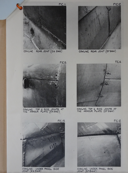
pp.252-3 tell how in 1942 a few Spitfires were given the filler-sanding-gloss-paint treatment to see how much faster they would go. References are to reports in the National Archive.
I find this surprising, as it had all been done before. The skin of the original prototype K5054 was flush-rivetted. Its sleek, high-gloss pale blue-grey finish was applied by Rolls-Royce craftsmen using similar methods. The technique can only have come from the motor car division. Firstly, only they had the craftsmen. Secondly, the finish tended to crack up under the high-stress, high-vibration regime of high-speed flight. It may have been OK for a solidly-built motor car with luxury-grade suspension, but it was hopelessly impractical for operational RAF service and was abandoned.
Flush rivets may have been a hi-tech innovation, but they were labour-intensive. To reduce manufacturing time and cost in production, a programme of replacing them with domed was implemented. Split peas were glued over the rivets in various areas and flight speeds compared. These tests resulted in the pattern of domed vs flush seen on the production aircraft.
The Speed Spitfire later received a similar paint treatment (not sure about the rivets), but never flew in anger.
With all this behind them, why bother to repeat the exercise six years later, on several Spits, and in the middle of a hectic war? Comparison with the Mustang could have been made far more easily by gluing split peas Spitfire-pattern onto a single Mustang, and perhaps adding the odd piece of sheet to simulate panel overlaps, to slow it down. What do those reports in the National Archive really tell us?
 
Last edited:
With all this behind them, why bother to repeat the exercise five years later, on several Spits, and in the middle of a hectic war?
Because a Spitfire Vc with a Merlin 45-series engine or a VIII with Merlin 61 is a very different beast from K5054 - especially with cannon sticking out of their wings, outer barrel shrouds, occasional four-cannon fits, different exhausts, maybe a draggy tropical filter on the Vc, bomb racks, etc. etc. etc. Throw in an LF engine fit on the Vc and it becomes even more different.

Aircraft development never sleeps, especially with the development cycles for new variants being much shorter than the conflict (something you won't see today).
 
pp.252-3 tell how in 1942 a few Spitfires were given the filler-sanding-gloss-paint treatment to see how much faster they would go. References are to reports in the National Archive.
I find this surprising, as it had all been done before. The skin of the original prototype K5054 was flush-rivetted. Its sleek, high-gloss pale blue-grey finish was applied by Rolls-Royce craftsmen using similar methods. The technique can only have come from the motor car division. Firstly, only they had the craftsmen. Secondly, the finish tended to crack up under the high-stress, high-vibration regime of high-speed flight. It may have been OK for a solidly-built motor car with luxury-grade suspension, but it was hopelessly impractical for operational RAF service and was abandoned.
Flush rivets may have been a hi-tech innovation, but they were labour-intensive. To reduce manufacturing time and cost in production, a programme of replacing them with domed was implemented. Split peas were glued over the rivets in various areas and flight speeds compared. These tests resulted in the pattern of domed vs flush seen on the production aircraft.
The Speed Spitfire later received a similar paint treatment (not sure about the rivets), but never flew in anger.
With all this behind them, why bother to repeat the exercise five years later, on several Spits, and in the middle of a hectic war? Comparison with the Mustang could have been made far more easily by gluing split peas Spitfire-pattern onto a single Mustang, and perhaps adding the odd piece of sheet to simulate panel overlaps, to slow it down. What do those reports in the National Archive really tell us?
2020-11-10 13_18_46-Window.png

There is probably an entire book chapter for someone on the three archive papers cited, and they contain many interesting aspects of Spitfire development which are of no direct relevance to my book, I was simply making the point clear that the the fit and finish of wartime Spitfires was often really pretty poor. However as recorded, these changes did not account for anything like the performance difference between the Mustang and Spitfire, which essentially forced the British to admit that it was simply inherently aerodynamically inferior (in terms of drag) to the Mustang. The papers also show comparison between Spitfires from all three main Spitfire plants, so it was also about attempting to keep everyone in line. This was obviously a very unpopular conclusion for the British to be forced to deal with at the time...

The points raised by Mr pathology above are also relevant. Its about finding out what the real impact on performance of wartime British manufacturing conditions was, not about re-doing studies on rivetting in general terms. etc. Hope that makes sense.
 
Last edited:
While looking at pp 252-3, as mentioned by steelpillow, I noticed that on page 252 four times the name Schmeud is mentioned.
I assume that Edgar Schmued was meant, with ue not eu.

So far I have only been a happy browser so I don't know whether his name was misspelled also on other pages, as he is not mentioned in the index.

Maybe this is one of the typing errors that is already corrected in the 2nd printing.
I hope Calum will inform us which typing errors were corrected so that the many buyers of the 1st printing, who thereby made the 2nd printing feasible, are not left behind.
Should any major Erratum emerge, it would be made public. Everything minor anyone posts will, and has been immidiately incorporated into the next print.
 
With all this behind them, why bother to repeat the exercise five years later, on several Spits, and in the middle of a hectic war?
Because a Spitfire Vc with a Merlin 45-series engine or a VIII with Merlin 61 is a very different beast from K5054 - especially with cannon sticking out of their wings, outer barrel shrouds, occasional four-cannon fits, different exhausts, maybe a draggy tropical filter on the Vc, bomb racks, etc. etc. etc. Throw in an LF engine fit on the Vc and it becomes even more different.
My apologies but I see no direct connection between your post and mine. I am not aware that guns and exhausts were ripped off Spitfires in order to compare them with the Mustang.
 
I was simply making the point clear that the the fit and finish of wartime Spitfires was often really pretty poor. However as recorded, these changes did not account for anything like the performance difference between the Mustang and Spitfire, which essentially forced the British to admit that it was simply inherently aerodynamically inferior (in terms of drag) to the Mustang.
Indeed.
The papers also show comparison between Spitfires from all three main Spitfire plants, so it was also about attempting to keep everyone in line. This was obviously a very unpopular conclusion for the British to be forced to deal with at the time...
So, more of a PR exercise than a technical one, then. Makes sense in an unhappy kind of way. A shame such efforts had to be expended to make industry wake up and smell the coffee.

The points raised by Mr pathology above are also relevant. Its about finding out what the real impact on performance of wartime British manufacturing conditions was, not about re-doing studies on rivetting in general terms. etc. Hope that makes sense.
Well, I don't think that armament, engine and filter fits constitute "manufacturing conditions". Sorry, but the relevance of that post still remains obscure to me. Showing that a Spit with bomb racks and tropical filter is slower than a Mustang without them is hardly a tenable comparison, as those at the time would have been well aware.
You are correct to highlight overlapping panels as an issue in the poor surface finish of Spits. Like those panels, domed rivets were part of the mechanical design rather than an assembly-line quality issue. And like those panels, their effect on performance was already known, so there was no need to revisit them. Oddly, there did appear to be a perceived need to revisit the panels.
Given the technical incongruity of such a distinction, the nature of the exercise as a hearts-and-minds one does make more sense.
 
With all this behind them, why bother to repeat the exercise five years later, on several Spits, and in the middle of a hectic war?
Because a Spitfire Vc with a Merlin 45-series engine or a VIII with Merlin 61 is a very different beast from K5054 - especially with cannon sticking out of their wings, outer barrel shrouds, occasional four-cannon fits, different exhausts, maybe a draggy tropical filter on the Vc, bomb racks, etc. etc. etc. Throw in an LF engine fit on the Vc and it becomes even more different.
My apologies but I see no direct connection between your post and mine. I am not aware that guns and exhausts were ripped off Spitfires in order to compare them with the Mustang.
I'm not sure what point you're trying to make, aside from being deliberately adversarial (and arguably anglophobic into the bargain).

I am saying that the V-series and subsequent Spitfires had a different aerodynamic and power-at-height profile from the prototype, and this alone means that doing a strip-and-polish speed test to see what can be achieved does NOT constitute unnecessary repetition of the work done on K5054. That holds whether you're comparing it to a random Spitfire with the same fit-out pulled from a line squadron or to another aircraft entirely.


Even the most insanely loyal Spitfire enthusiast is willing to admit that a Merlin Spitfire never even comes close to beating a Merlin Mustang. Nor should it - the chronological gap in development times isn't large, but the difference this made in terms of performance advances is at least one aerodynamic generation and possibly two.

In addition, please allow for the fact that the Mustang was built in a nation with the greatest and most powerful industrial capability on Earth at the time, with its factories completely immune to bombing, with essentially unlimited capacity for expansion, and with essentially limitless resources available on its own soil. Britain didn't have that luxury, and at least through 1941 was under a lot of pressure. There were bound to be shortcuts in manufacture.
 
Not an erratum as such, but....
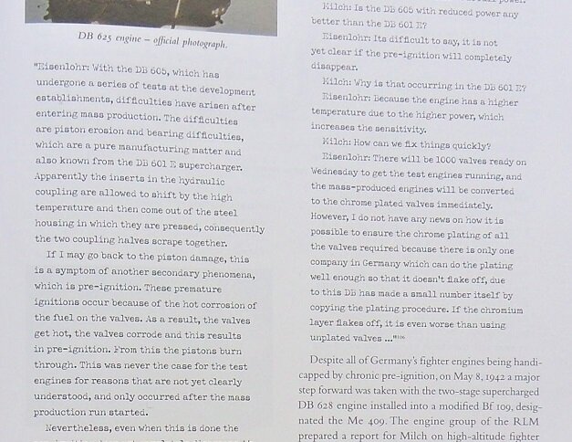
the text contains a fairly large number of direct quotes. These have been typeset in a typewriter font. Unfortunately, the typewriter in question is worn out. Sections of various letters are faded out, and legibility of these quotes suffers as a result.
I'm struggling a bit to read those quotes.
I`m sorry to hear that, however, I have not had any other readers reporting such a difficulty. Which specific section did you struggle with (please provide page #).

The proofs are extremely clear, so if there has been a printing error, please alert us. There are no faded letters which are anywhere near the degree of being illegible in my copies. Feel free to take a photograph of faded sections so we can investigate.
 
I'm not sure what point you're trying to make
I was simply pointing out that, vis-a-vis the post of mine which you quoted, I was not sure what point you're trying to make. Your subsequent remarks seem equally unconnected to it. I am sure you see some valid connection somewhere, but I fear we are now beyond digging it out.

My apologies if that appears deliberately adversarial and anglophobic. I trust that for others, my track record on this forum may persuade them otherwise.
 
Not an erratum as such, but....
the text contains a fairly large number of direct quotes. These have been typeset in a typewriter font. Unfortunately, the typewriter in question is worn out. Sections of various letters are faded out, and legibility of these quotes suffers as a result.
I'm struggling a bit to read those quotes.
I`m sorry to hear that, however, I have not had any other readers reporting such a difficulty. Which specific section did you struggle with (please provide page #).

The proofs are extremely clear, so if there has been a printing error, please alert us. There are no faded letters which are anywhere near the degree of being illegible in my copies. Feel free to take a photograph of faded sections so we can investigate.

I did have that problem a bit when I started. Several letters seem consistently thin at the top and/or a little blobby at the bottom. But once I got used to the fine print quality I saw that the font simply gets a bit thin in places, and I slowly got used to the blobby feeling - as one does when reading any hand-typed script.
I'd suggest that most computer fonts are designed for less fine quality and assume a certain bleed in printing which thickens the strokes. This thickening is absent in this book, so all the text looks half a weight lighter. Well, maybe.
 
I also find the font used for the quotes unpleasant to read.

The quotes look like they were typed using an old typewriter with a used up ink ribbon, resulting in a lot of unclear letters.

Presumably that was the intention of the graphical designer to indicate that it is old material, but it is not nice.
 
It might be more distracting for non-native speakers, who don't have quite the same built-in recognition systems.

Judging by this screenshot, I can understand this. Its a 'distressed' typewriter font like Crud font which I used a lot 20 years ago for rave flyers and an early version of the Secret Projects Forum logo.

1597873392754-png.639725
 
The quoted letters in my copy of the book are lighter and thinner than those in the above screenshot in overscan's post.

They are not illegible but after a while reading them becomes somewhat tiresome, especially when the quote is over one or more pages, like for example 272-273.

The light conditions are now unsuitable to take a representative photo, so I will try tomorrow.
 
I tried some scans of a similar passage, with varying resolutions and either photograph or document scan modes. On some I did a bit of post-processing, such as reducing resolution and/or enhancing contrast to whiten the background. Overall resolutions compared varied between 150 and 800.
The letters do look perceptually a bit more solid and even in a scan than on the page. That varies surprisingly little with scan parameters, all of which look much as overscan's image (which is 150 dpi). So it seems to be a subjective factor not an objective one. I think the brightness of the paper may be the main reason, causing the whiteness to perceptually bleed over the edge of the letter strokes. But that is just a first impression.

Compare say the upper vertical stroke of a "d" with the lower curve of an "s" and, on the higher-res scans especially, there is a big difference in line weight. I would suspect that the font designer followed the usual practice for small font sizes and assumed the usual slight bleed of ink around each printed stroke and thinned them accordingly. However the high print quality of this book reduces that bleed to almost nothing and consequently the thin strokes are too thin. It has proportionately less effect on the thick lower strokes.

This style of blobby low down and thin higher up was used a few years back in an experimental font for dyslexics. I tried it on some dyslexic friends and they reported it was worse than useless - the row of blobs seriously disrupted their already-limited ability to perceive letter ordering. (FWIW dyslexia was not a recognised condition in adults in the 1940s, so nobody would have thought to redesign or clean such a typewriter). So one might expect very different responses to this font from different readers.

My personal view is that reproducing a period look is a cute idea, although here it does not respect a fixed pitch for all characters, with punctuation ans spaces having a different pitch from the actual letters. So the whole effect becomes more mannered than authentic. But more importantly, unless and until a less mannered font, intermediate between this and the awful computer-oriented Courier, can be designed, then the conventional setting of the main typeface in italics is far the better option. Ragged right to taste.

There you go, when someone's godfather was a professional typographer, these rambles will out.

I like Inconsolata for a monospaced font.


Special Elite is a reasonably readable 'distressed typewriter' font.

 
Not an erratum as such, but....
the text contains a fairly large number of direct quotes. These have been typeset in a typewriter font. Unfortunately, the typewriter in question is worn out. Sections of various letters are faded out, and legibility of these quotes suffers as a result.
I'm struggling a bit to read those quotes.
I`m sorry to hear that, however, I have not had any other readers reporting such a difficulty. Which specific section did you struggle with (please provide page #).

The proofs are extremely clear, so if there has been a printing error, please alert us. There are no faded letters which are anywhere near the degree of being illegible in my copies. Feel free to take a photograph of faded sections so we can investigate.

I can rule out a printing error: the text adjacent to the quotes is nice and crisp. The scan provided by Paul shows the issue fairly well: for example, the horizontal stroke in the center of the capital E is barely visible to me. The top of the lowercase n too.

I'm probably more sensitive to this than most people: my vision isn't optimal at the moment. I can read most books without problem, but for small lettering (pill bottles etc.) I need to take off my glasses.
Also, my job involves a lot of layout work for printed material, so I've studied legibility etc. and am more aware than most of the pitfalls.
 
I don't have a copy of the book to hand, so I can't comment directly on the print quality, etc., but looking at the scans above, the effect is not good, and dare I say it, somewhat 'amateurish' ?
As Steelpillow says, using the same typeface but italicised would be a lot more 'professional' looking. Another way of handling quotes like this that I've seen, is to use the same font as the main text, but a couple of point sizes smaller. Obviously, this may not be practical, depending on the body type point size . . .
Also, print quality can vary across the printed sheet. This can be down to various causes, usually as a result of poor press maintenance. ( I should know, I was an 'Inky' for 30 years . . . )

cheers,
Robin.
 
When looking back in this topic I have the impression that the samples shown in the past are more black and sharper than in my copy of the book, where the normal text is less black and the letters thinner (but still OK), and the quoted text is more grey than black, and part of the letters very thin. Especially capital letters are poor. This applies to all quotes throughout the book. I keep reading K where it actually says M.

Pages 269 through 279 consist almost entirely of quotes and then reading becomes tiresome even if I use reading glasses (+1). I suppose it also depends on the reader, some people may dislike it, others may hardly notice.

Here is a part of page 269 that contains quotes as well as normal text on bottom right:

SHPR  p269.jpg

Keep in mind that in the book the quoted lines are only 67 mm long, so to have a realistic view one should adjust image size to reflect that on the screen.
The photo size now is such that quote lines are 100 mm on my 24 inch monitor, so that should give 67 mm on a 16 inch laptop.
 
Last edited:
I don't have a copy of the book to hand, so I can't comment directly on the print quality, etc., but looking at the scans above, the effect is not good, and dare I say it, somewhat 'amateurish' ?
As Steelpillow says, using the same typeface but italicised would be a lot more 'professional' looking. Another way of handling quotes like this that I've seen, is to use the same font as the main text, but a couple of point sizes smaller. Obviously, this may not be practical, depending on the body type point size . . .
Also, print quality can vary across the printed sheet. This can be down to various causes, usually as a result of poor press maintenance. ( I should know, I was an 'Inky' for 30 years . . . )

cheers,
Robin.

Hi Robin,

There is a thread on this very forum called "What should authors concentrate on?" - where much commentary along the lines of
"why has nobody slaved in archives for years for almost no financial return to write a book about my favorite XYZ yet?"

Well, comments like yours are right up there at the top of the list for that. Insulting my book, the editors, the contributors, the proof readers
over a book which you not only have not even read but dont actually own.

Quite literally, unbelievable.
 
I edited Calum's book. It is based entirely on primary source documents accumulated during six years of intensive research in archives around the world. Rather than paraphrase or use his sources' words as his own, Calum has presented the precise wording as it appears in the original documents. These are words which, without Calum, might have remained buried and inaccessible for the remainder of our lifetimes. Few would have known they ever existed at all.
Yet here they are. Someone, a professional historian perhaps, might have dug them out - but how many historians of any stripe have the in-depth technical knowledge of a man who designs and engineers high-performance piston engines for a living? Calum's interpretation of those words, the primary source evidence, is the considered opinion of a professional at the top of his game - who demonstrably has the respect and admiration of other professionals in his field. Prior to the pandemic he was regularly presenting his research and his interpretation of that research to auditoriums packed with Formula 1 race engineers who would later give him rave reviews.
This book breaks new ground in many ways and readers will not find its like anywhere else.
The fonts used are the way they are and complaining about them in isolation, rather than offering an opinion about the book's actual content, achieves nothing beyond pointlessly 'trolling' an author who has spent years uncovering and attempting to tell an incredible story which might otherwise never have been told.
 
I don't believe any insult was intended by Rob, my impression is that he put 'amateurish'/'professional' in single quotes exactly as an attempt to preempt such an interpretation of his comments. A classic case of "for lack of a better word".

In that context, I think criticism of the fonts for the original document quotes "in isolation" is perfectly constructive - the content and presentation are separate aspects of a book, and can thus be considered separately. Most importantly however, criticism of one aspect does nothing to detract from the merits of the other!

I have regrettably not yet had the opportunity to truly dive into the book in order to fairly judge the content, but will happily defer to the rave reviews Dan mentions - which were after all what clinched my decision to purchase in the first place. What I can say is that for me personally, the 'distressed typewriter' font works just fine, but as the case of the capital "E" in Paul's example image shows, parts of some letters do come out a bit faded and other people may have difficulties with that.

Is there not objectively a lesson to be learned here, which at the same time does not reflect in any way negatively on Calum's research, expertise and writing?
 
Last edited:
The book looks the way it looks and that won't change. The lesson to be learned, perhaps, is that you can't please everybody all of the time.
 
...................
The fonts used are the way they are and complaining about them in isolation, rather than offering an opinion about the book's actual content, achieves nothing beyond pointlessly 'trolling' an author who has spent years uncovering and attempting to tell an incredible story which might otherwise never have been told.
Nobody is 'trolling' Calum. His enormous effort in the past five years is praiseworthy.
Some of us are merely a little disappointed that such a great book is slightly spoiled by the poor font of the quotes.

The issue of the font used for quotes was first brought up by Hobbes in post #215.
Then Calum responded that he "had not had any other readers reporting such a difficulty" and asked "to take a photograph of faded sections so we can investigate".
In response steelpillow mentioned "that the font simply gets a bit thin in places, and I slowly got used to the blobby feeling".
I agreed and responded that "I find the font used for the quotes unpleasant to read." In a later post I explained why and posted a photo, as suggested by Calum.

It is not intended as criticism but merely to illustrate that in future editions or other books it would be better to select another font for quotes. That's all.

The second printing of the book, about to commence, will address minor issues on 24 pages. The fonts will remain the same, however. The use of a distressed typewriter style for quotes in The Secret Horsepower Race was intended right from the very beginning. No other books in the Tempest Books range use this style.
I must respectfully disagree with your point that a great book can be spoiled if it is printed in any given font that you personally dislike. I would suggest that a great book remains a great book regardless of the fonts used in its presentation.
Imagine you had slaved over a book for years and all the critics had to say about it was how much they disliked the fonts used. Would you be overjoyed to see that someone had ignored absolutely everything you had written and chosen instead to complain about the font it was printed in? Or would you, instead, feel as though you were being trolled by such comments.
May I ask, instead, how you feel about Calum's account of the dissemination of the swirl throttle? Perhaps you would like to comment on his narrative concerning Germany's secret fuel production processes - do you think he got it right? Is he wrong to criticise British intelligence for failing to realise that the chemical German prisoners of war were referring to as 'ha-ha' was nitrous oxide? Is Calum's account of America's hyper engine developments appropriately balanced?
Perhaps these topics are less interesting than a discussion about fonts.
 
I want to expand on the issue of original source documents, including photos. I know people who have spent 10, 20 or more years collecting original documents. There were so many pages of original German documents collected to be microfilmed that it took until 1947 to complete the job. Tons of original documents were shipped out of the country to the US, and various groups in Germany, including the Deutsches Museum, have spent decades negotiating for their return. Many were not released until the fall of the Soviet Union, others were held in private collections and by individuals. I have spent years tracking down what I could. I am still finding new, meaning previously unknown to me, sources of such documents. Another researcher obtained an original period drawing of an aircraft he personally loved. His wife refused to allow it to be hung in the living room.

In the world of military history book publishing, contract information is rarely disclosed. Many complete their books for the reason of giving to posterity an accurate record of what happened. This in turn inspires others to complete the picture to the degree that is possible. A recent book about a German World War I tank was released with unpublished photos and corrected information.

I was particularly gobsmacked to see that Calum had managed to find photographs of the Messerschmitt Me 409. Who would have thought that was even real, let alone that photographs of it still existed buried in the vast unindexed sections of Daimler-Benz's archives. As athpilot has pointed out elsewhere, there are likely yet more treasures to be discovered in such places.
 
...................
The fonts used are the way they are and complaining about them in isolation, rather than offering an opinion about the book's actual content, achieves nothing beyond pointlessly 'trolling' an author who has spent years uncovering and attempting to tell an incredible story which might otherwise never have been told.
Nobody is 'trolling' Calum. His enormous effort in the past five years is praiseworthy.
Some of us are merely a little disappointed that such a great book is slightly spoiled by the poor font of the quotes.

The issue of the font used for quotes was first brought up by Hobbes in post #215.
Then Calum responded that he "had not had any other readers reporting such a difficulty" and asked "to take a photograph of faded sections so we can investigate".
In response steelpillow mentioned "that the font simply gets a bit thin in places, and I slowly got used to the blobby feeling".
I agreed and responded that "I find the font used for the quotes unpleasant to read." In a later post I explained why and posted a photo, as suggested by Calum.

It is not intended as criticism but merely to illustrate that in future editions or other books it would be better to select another font for quotes. That's all.

The second printing of the book, about to commence, will address minor issues on 24 pages. The fonts will remain the same, however. The use of a distressed typewriter style for quotes in The Secret Horsepower Race was intended right from the very beginning. No other books in the Tempest Books range use this style.
I must respectfully disagree with your point that a great book can be spoiled if it is printed in any given font that you personally dislike. I would suggest that a great book remains a great book regardless of the fonts used in its presentation.
Imagine you had slaved over a book for years and all the critics had to say about it was how much they disliked the fonts used. Would you be overjoyed to see that someone had ignored absolutely everything you had written and chosen instead to complain about the font it was printed in? Or would you, instead, feel as though you were being trolled by such comments.
May I ask, instead, how you feel about Calum's account of the dissemination of the swirl throttle? Perhaps you would like to comment on his narrative concerning Germany's secret fuel production processes - do you think he got it right? Is he wrong to criticise British intelligence for failing to realise that the chemical German prisoners of war were referring to as 'ha-ha' was nitrous oxide? Is Calum's account of America's hyper engine developments appropriately balanced?
Perhaps these topics are less interesting than a discussion about fonts.


Of the few comments I've read, it is distressing to see unsupported assertions. Criticism is good only when it is backed up by a credible source as the reason. The world's largest chemical cartel at the time, IG Farben, is not of great interest to most. In fact, two gentlemen from Germany visited my place of work. One was going to University to get an education in Chemistry. When his English speaking friend asked him about IG Farben at my request, he shrugged his shoulders and said he'd never heard of it.

The Americans had to produce a specialized dictionary of German aeronautical terms to insure that the captured German documents that were released to the builders and developers of aircraft were fully understood. This is a book that will, or should, require readers to look up various terms to fully grasp what was going on at the time.
 
You put together four people with experience of publishing and you will get at least six inconsistent opinions on the typesetting and layout.
You trawl ten thousand source documents, write a book and another thousand come along.
I can ramble on about fonts and house styles and narrative arcs ad nauseam, but I have said more than enough here.

What I really love about this book are its expertly informed content, through which the author's own love of his subject shines bright, along with the unique and groundbreaking historical narrative he has achieved despite focusing down on a limited set of archives.

Which reminds me, I have yet to put my name down for a copy of newsdeskdan's blockbuster on German jet aircraft.
 
I want to expand on the issue of original source documents, including photos. I know people who have spent 10, 20 or more years collecting original documents. There were so many pages of original German documents collected to be microfilmed that it took until 1947 to complete the job. Tons of original documents were shipped out of the country to the US, and various groups in Germany, including the Deutsches Museum, have spent decades negotiating for their return. Many were not released until the fall of the Soviet Union, others were held in private collections and by individuals. I have spent years tracking down what I could. I am still finding new, meaning previously unknown to me, sources of such documents. Another researcher obtained an original period drawing of an aircraft he personally loved. His wife refused to allow it to be hung in the living room.

In the world of military history book publishing, contract information is rarely disclosed. Many complete their books for the reason of giving to posterity an accurate record of what happened. This in turn inspires others to complete the picture to the degree that is possible. A recent book about a German World War I tank was released with unpublished photos and corrected information.

I was particularly gobsmacked to see that Calum had managed to find photographs of the Messerschmitt Me 409. Who would have thought that was even real, let alone that photographs of it still existed buried in the vast unindexed sections of Daimler-Benz's archives. As athpilot has pointed out elsewhere, there are likely yet more treasures to be discovered in such places.


I am fortunate to have among my collection of books, published photos of aircraft that supposedly never existed or were never built. I was quite pleased to locate a photo of the DFS 331 on German eBay. Previous to that, a set of color slides on US eBay. These slides were later used in highly specialized books. Other books have been published about advanced aircraft but they sell quickly and disappear or reappear for sale at prices far above what I can afford.
 
Imagine you had slaved over a book for years and all the critics had to say about it was how much they disliked the fonts used. Would you be overjoyed to see that someone had ignored absolutely everything you had written and chosen instead to complain about the font it was printed in? Or would you, instead, feel as though you were being trolled by such comments.

I'm rather dismayed to see a discussion I started get out of hand.

I've read pages 1-35 so far, which means I'm not in a position yet to have an informed opinion beyond "I like this book". What I did find, was some difficulty reading the quoted sections, which I reported (as I thought, in line with Calum's request for errata).

I did not intend to disparage the work that's gone into the writing and editing of this book, and I apologize if my comments caused a problem.
 
With respect, @newsdeskdan and @Calum Douglas should be listening carefully to the feedback presented by the book readers.

@robunos was commenting without seeing the book, sure, based on the scans presented and his printing experience, that can be annoying.

@Hobbes was just trying to be helpful based on his experience.

I personally don't have any issue reading the "distressed typewriter" font, but the people reporting it being annoying or challenging to read are not making it up, nor are they doing it to be awkward or picky.

How many of the book's proofreaders are dyslexic, partially sighted, or non-native English speakers? I'd wager none.

Stylistically, I like the 'old typewriter' effect, but some letter forms are quite unclear, but readable in context, and I'd personally as a designer hesitate before using it outside of a heading. Body text needs to be effortlessly readable on a book of this length, and due to the length of some quotes, they are body text. There are conventions in printing which are largely personal taste or house style. Others (e.g. using columns to avoid over long lines) are generally proven to improve readability.

Altering the quote typeface to a less distressed looking font might only help a small percentage of readers, but it doesn't disadvantage anyone else either. I do appreciate it would potentially alter pagination though, which might be a dealbreaker for a corrected reprint.

2nd Edition though.....
 
Last edited:
Okay . . .
I seem to accidentally upset some people, so let me set the record straight.
In NO way at all am I criticising ANY part of the editorial content of this book.
Even if I owned a copy, I do not possess the depth of knowledge of the subject to be able to judge what is written within it.
( As to why I don't own a copy, until my current job , and therefore income, is no longer adversely affected by the Pandemic, I'm afraid it's necessities only . . . )
My comment was directed solely at the issue raised in Hobbes' post #215 above, and was intended purely to be constructive.
With hindsight, I can see that 'amateurish' was perhaps an inappropriate choice of word.
Having followed this thread from it's beginning, I certainly can see, and appreciate, the amount of time and effort that has gone into it's production, and from the comments posted here by members who do possess a copy, it does appear to be an excellent volume, one which I am greatly anticipating obtaining.

cheers,
Robin.
 
Back
Top Bottom