- Joined
- 1 April 2006
- Messages
- 11,053
- Reaction score
- 8,512
http://www.nytimes.com/2010/04/27/world/27powerpoint.html
April 26, 2010
We Have Met the Enemy and He Is PowerPoint
By ELISABETH BUMILLER
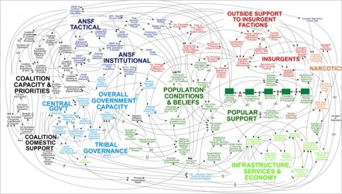
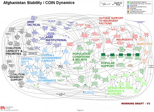
WASHINGTON — Gen. Stanley A. McChrystal, the leader of American and NATO forces in Afghanistan, was shown a PowerPoint slide in Kabul last summer that was meant to portray the complexity of American military strategy, but looked more like a bowl of spaghetti.
“When we understand that slide, we’ll have won the war,” General McChrystal dryly remarked, one of his advisers recalled, as the room erupted in laughter.
The slide has since bounced around the Internet as an example of a military tool that has spun out of control. Like an insurgency, PowerPoint has crept into the daily lives of military commanders and reached the level of near obsession. The amount of time expended on PowerPoint, the Microsoft presentation program of computer-generated charts, graphs and bullet points, has made it a running joke in the Pentagon and in Iraq and Afghanistan.
“PowerPoint makes us stupid,” Gen. James N. Mattis of the Marine Corps, the Joint Forces commander, said this month at a military conference in North Carolina. (He spoke without PowerPoint.) Brig. Gen. H. R. McMaster, who banned PowerPoint presentations when he led the successful effort to secure the northern Iraqi city of Tal Afar in 2005, followed up at the same conference by likening PowerPoint to an internal threat.
“It’s dangerous because it can create the illusion of understanding and the illusion of control,” General McMaster said in a telephone interview afterward. “Some problems in the world are not bullet-izable.”
In General McMaster’s view, PowerPoint’s worst offense is not a chart like the spaghetti graphic, which was first uncovered by NBC’s Richard Engel, but rigid lists of bullet points (in, say, a presentation on a conflict’s causes) that take no account of interconnected political, economic and ethnic forces. “If you divorce war from all of that, it becomes a targeting exercise,” General McMaster said.
Commanders say that behind all the PowerPoint jokes are serious concerns that the program stifles discussion, critical thinking and thoughtful decision-making. Not least, it ties up junior officers — referred to as PowerPoint Rangers — in the daily preparation of slides, be it for a Joint Staff meeting in Washington or for a platoon leader’s pre-mission combat briefing in a remote pocket of Afghanistan.
Last year when a military Web site, Company Command, asked an Army platoon leader in Iraq, Lt. Sam Nuxoll, how he spent most of his time, he responded, “Making PowerPoint slides.” When pressed, he said he was serious.
“I have to make a storyboard complete with digital pictures, diagrams and text summaries on just about anything that happens,” Lieutenant Nuxoll told the Web site. “Conduct a key leader engagement? Make a storyboard. Award a microgrant? Make a storyboard.”
Despite such tales, “death by PowerPoint,” the phrase used to described the numbing sensation that accompanies a 30-slide briefing, seems here to stay. The program, which first went on sale in 1987 and was acquired by Microsoft soon afterward, is deeply embedded in a military culture that has come to rely on PowerPoint’s hierarchical ordering of a confused world.
“There’s a lot of PowerPoint backlash, but I don’t see it going away anytime soon,” said Capt. Crispin Burke, an Army operations officer at Fort Drum, N.Y., who under the name Starbuck wrote an essay about PowerPoint on the Web site Small Wars Journal that cited Lieutenant Nuxoll’s comment.
In a daytime telephone conversation, he estimated that he spent an hour each day making PowerPoint slides. In an initial e-mail message responding to the request for an interview, he wrote, “I would be free tonight, but unfortunately, I work kind of late (sadly enough, making PPT slides).”
Defense Secretary Robert M. Gates reviews printed-out PowerPoint slides at his morning staff meeting, although he insists on getting them the night before so he can read ahead and cut back the briefing time.
Gen. David H. Petraeus, who oversees the wars in Iraq and Afghanistan and says that sitting through some PowerPoint briefings is “just agony,” nonetheless likes the program for the display of maps and statistics showing trends. He has also conducted more than a few PowerPoint presentations himself.
General McChrystal gets two PowerPoint briefings in Kabul per day, plus three more during the week. General Mattis, despite his dim view of the program, said a third of his briefings are by PowerPoint.
Richard C. Holbrooke, the Obama administration’s special representative for Afghanistan and Pakistan, was given PowerPoint briefings during a trip to Afghanistan last summer at each of three stops — Kandahar, Mazar-i-Sharif and Bagram Air Base. At a fourth stop, Herat, the Italian forces there not only provided Mr. Holbrooke with a PowerPoint briefing, but accompanied it with swelling orchestral music.
President Obama was shown PowerPoint slides, mostly maps and charts, in the White House Situation Room during the Afghan strategy review last fall.
Commanders say that the slides impart less information than a five-page paper can hold, and that they relieve the briefer of the need to polish writing to convey an analytic, persuasive point. Imagine lawyers presenting arguments before the Supreme Court in slides instead of legal briefs.
Captain Burke’s essay in the Small Wars Journal also cited a widely read attack on PowerPoint in Armed Forces Journal last summer by Thomas X. Hammes, a retired Marine colonel, whose title, “Dumb-Dumb Bullets,” underscored criticism of fuzzy bullet points; “accelerate the introduction of new weapons,” for instance, does not actually say who should do so.
No one is suggesting that PowerPoint is to blame for mistakes in the current wars, but the program did become notorious during the prelude to the invasion of Iraq. As recounted in the book “Fiasco” by Thomas E. Ricks (Penguin Press, 2006), Lt. Gen. David D. McKiernan, who led the allied ground forces in the 2003 invasion of Iraq, grew frustrated when he could not get Gen. Tommy R. Franks, the commander at the time of American forces in the Persian Gulf region, to issue orders that stated explicitly how he wanted the invasion conducted, and why. Instead, General Franks just passed on to General McKiernan the vague PowerPoint slides that he had already shown to Donald H. Rumsfeld, the defense secretary at the time.
Senior officers say the program does come in handy when the goal is not imparting information, as in briefings for reporters.
The news media sessions often last 25 minutes, with 5 minutes left at the end for questions from anyone still awake. Those types of PowerPoint presentations, Dr. Hammes said, are known as “hypnotizing chickens.”
Helene Cooper contributed reporting.
Graphics: A PowerPoint diagram meant to portray the complexity of American strategy in Afghanistan certainly succeeded in that aim.


