Powerpoint engineering and the downfall of quality

Orionblamblam

ACCESS: USAP
Top Contributor
Senior Member
Joined
5 April 2006
Messages
12,082
Reaction score
10,335
Website
www.aerospaceprojectsreview.com

Back in the 1950’s and 1960’s - you know, when there was actual progress in aerospace - aerospace companies and organizations had people on staff who were paid, skilled artists and draftsmen. Many of even the simplest presentations were thus filled with high-quality sketches, drawings, artwork, photos of scale models, etc. But in recent years, certainly since before my aerospace career began in the mid 90’s, there has been a consolidation of skills into a smaller and smaller group of people. I often heard tales of how the floor of the office was ringed with engineers on the outside, filled with draftsmen in the middle, and had secretaries/technical writers on the ends. The engineers would crunch the numbers, the draftsmen would make the drawings, the secretaries and writers would write up the reports (often using little more than random scribbles and scraps scrawled by the engineers). The system may have been unweildy and inefficient, but obviously it worked.

But with the rise of the personal computer, word processing programs and CAD programs, the apparent “need” for the non-engineers declined. Why have a draftsman when the engineer can do the drafting himself? Who needs a secretary when the engineer can do the writing himself?
 
Quite right, but not limited to the aviation industry. Financial resources are (said to be !) scarce
and the time frame for new developments has become longer. So, the nitpickers add up the time,
they are paying for their highly qualified personal, dividing it by the number and ... theirs plenty of
"spare time" ! The higher the qualification, the harder it is to replace someone, so with a grumble
they have to keep their engineers, or at least a number of them. Are they really expecting too much,
if those engineers are asked to make drawings or writing text on their own and of course making
coffee on their own ? Of course, when a new project actually starts, then the remaining key personal
is swamped with tasks, that often cannot be fulfilled all in time and if done, there may be still some
flaws, because it's normal, that making the proverbial powerpoint presentation for the boss is much more
important, than checking calculations twice, or thinking about alternative solutions. And very, VERY
important tasks, that have to be done not at once, but yesterday, still can be "outsourced" on short notice.
Often really funny to see the results from those outsiders ! ;D
 
*chuckle* It started before Powerpoint. Back in 1983, one of my associates on the B-2 at Pico Rivera produced a beatuiful syllabus for a "Masters of Science in Viewgraph Engineering". I sorely wished I'd saved a copy.
 
Orionblamblam said:
http://up-ship.com/blog/?p=5079

Back in the 1950’s and 1960’s - you know, when there was actual progress in aerospace - aerospace companies and organizations had people on staff who were paid, skilled artists and draftsmen. Many of even the simplest presentations were thus filled with high-quality sketches, drawings, artwork, photos of scale models, etc. But in recent years, certainly since before my aerospace career began in the mid 90’s, there has been a consolidation of skills into a smaller and smaller group of people. I often heard tales of how the floor of the office was ringed with engineers on the outside, filled with draftsmen in the middle, and had secretaries/technical writers on the ends. The engineers would crunch the numbers, the draftsmen would make the drawings, the secretaries and writers would write up the reports (often using little more than random scribbles and scraps scrawled by the engineers). The system may have been unweildy and inefficient, but obviously it worked.

But with the rise of the personal computer, word processing programs and CAD programs, the apparent “need” for the non-engineers declined. Why have a draftsman when the engineer can do the drafting himself? Who needs a secretary when the engineer can do the writing himself?

Sorry for replying to this almost two months later, but I just only recently had the chance to read your whole post on your blog. Pretty much everything you described is what has happened with my former employer which I was laid off from almost a year ago. More and more of the drafting and other documentation responsibilities of our CAD department, which I was a part of, has gone to the engineers. They are drafting with different CAD programs and crude hand drawn sketches and the results are obvious. It's a documentation and organizational train wreck waiting to happen. Our department was once up to 6 people now it's practically down to 2.

At least the good news for me is that I was able to get out of a dead end job with a dead end company and I'm about to take some classes to get myself caught up with the more current CAD software on the market. :)
 
elmayerle said:
*chuckle* It started before Powerpoint. Back in 1983, one of my associates on the B-2 at Pico Rivera produced a beatuiful syllabus for a "Masters of Science in Viewgraph Engineering". I sorely wished I'd saved a copy.

I did that at Cheyenne Mountain at about the same time for the J-6's morning briefing before he briefed the CinC. I quickly found that it was really easy to run out of one syllable words that O-6's and above could understand!
 
Yes!
Since the 1980s, Canadian Armed forces staff officers have grumbled about "death by PowerPoint" briefings.

OTOH, the conceptual engineer who laid out the basic concept may have far too detailed a knowledge to explain it to non-specialist visitors.
The engineer who designed a system is often the worst person to write the technical manual, because technicians can only understand pretty picture books with simple written instructions broken down into bullet points. You still need technical writers who can simplify instructions enough that technicians can understand them.
 
There is nothing wrong with power point, 3d CAD gives you a much higher efficiency in the design process and a single designer can easily create complex designs which would have been the work of a whole team. The best way to present your design are screen shots direct from CAD/FEM post processing which are much easier accessible than classic drawings.

To give you an example I designed a cylinder head for a Chinese truck engine (a colleague was doing the intake/exhaust ports for me) within two and a half week and it entered production. This case is quite extreme and much shorter than recommended (fortunately the “post design fix” FEM calculations proved it would last…) but it worked. In former times, a whole team was doing a design, this was later sent to the foundry model shop, hand crafted, after that, the design needed to be fixed a couple of times and it took month before the casting could be done according to the drawings.

Mankind will always say, in the god old days everything was better, but the modern, three dimensional and more visual work style of engineering is much faster and more efficient than the old 2d-development process. To me, it is also more fun, to get a real optical impression of your work during the design process and it helps a lot to avoid small mistakes like not matching bore holes…
 
There is something more left to say, its easier to do the presentations by yourself than to explain others which parts should be presented in which way and what are the key questions about the design. It probably true, engineers are today more generalist than in the old days and the old folks were surly better in math than most engineers these days (including me). They had to use complex math much more than we do (Matlab & Co will do the job for us).

With the introduction of 3d printers you can add nice models to your presentation just like in the old days when model makers did these jobs. I’m sure, 99 % of the old engineers who worked in development departments before 1990 would have loved to use 3d CAD and FEM systems instead of drawing boards slide rules. Most of them, would have also preferred to show high quality screen shots of the design process instead of explaining a complex two dimensional drawing to a customer. Or waiting weeks until the graphic and models are ready for presentation.
 
It is an interesting conundrum. I would agree that moving forward from 20th Century methods is desirable. Indeed with the Army FVL program both competing vendors used "paperless" methods and both demonstrators (SB>1 and V-280) were built with incredible ease compared to previous platforms. At least in the rotorcraft industry that is the new standard. But that is not Power Point.

The problem with Power Point mentality is that it is all consuming. I have lived this for a number of years. More time is wasted with concern to get the perfect wording/color/graphic into a briefing, than what is the briefing about. "Don't worry about understanding what is on the slide, just change the font to arial bold." The best Power Point briefing I have had in years occurred earlier this year. Each slide had three, one sentence bullets. We had to talk and discuss, not try to read 8 font text and pictures. Best four hour meeting in years with less than ten slides. There are business books that warn about units going into "Power Point defilade," more focused on process of product.
 
Totally agree with that, beautiful presentations shoud not be the main aim, but it hepls a lot to document your work for a customer when you can show him the bullet point in 3d graphics instead of charts and drawings. I dont like meetings which last 4 hours, its hard to keep the concentration anyway, with or without power point.
 
Last edited:
It is an interesting conundrum. I would agree that moving forward from 20th Century methods is desirable. Indeed with the Army FVL program both competing vendors used "paperless" methods and both demonstrators (SB>1 and V-280) were built with incredible ease compared to previous platforms. At least in the rotorcraft industry that is the new standard. But that is not Power Point.

The problem with Power Point mentality is that it is all consuming. I have lived this for a number of years. More time is wasted with concern to get the perfect wording/color/graphic into a briefing, than what is the briefing about. "Don't worry about understanding what is on the slide, just change the font to arial bold." The best Power Point briefing I have had in years occurred earlier this year. Each slide had three, one sentence bullets. We had to talk and discuss, not try to read 8 font text and pictures. Best four hour meeting in years with less than ten slides. There are business books that warn about units going into "Power Point defilade," more focused on process of product.
Powerpoint is excellent for generating training material and work instructions. MBD, CATIA & Powerpoint. Powerpoint is great for explaining things. As for fonts, colors, etc. it's good to have a standard but it's definitely a rabbit hole you can go down if you're not careful.
 
Yes!
Since the 1980s, Canadian Armed forces staff officers have grumbled about "death by PowerPoint" briefings.

OTOH, the conceptual engineer who laid out the basic concept may have far too detailed a knowledge to explain it to non-specialist visitors.
The engineer who designed a system is often the worst person to write the technical manual, because technicians can only understand pretty picture books with simple written instructions broken down into bullet points. You still need technical writers who can simplify instructions enough that technicians can understand them.

That's what I do for a living.
Literally writing work instructions for building part of a big helicopter after I stop screwing around online this morning. :)
 
Well truth be told, that is what I do for a living now.

...

Doesn't mean I have to like it.
 
MYTHBUSTERS' Jamie wrote about how he had to take a fender off just to swap a battery. This was a flaw done by kids who never had to service anything. He then praised the 'slop' of the monkey wrench in Pop Mech. In Iraq-they ran machInes until they broke-only large glass furnaces should do that. I even heard one old man who talked about having to cut into a German coaster-car that had no access panel....and pulling out a double handful of shavings.
 
With every new technology/language, you need to concentrate on it for 10,000 hours to master it. Once mastered, you use the new technology/language as a too ... but that tool becomes a small part of your bigger process.

OTOH some small minds fixate on the new technology/language and fall down a rabbit hole.
Since those smaller minds have limited capacity, they need to drop - or never learn - an older skill.
 
I think you're seeing at least two technology trends at work here.
Firstly there is a big market push to lower headline purchase costs, which manufacturers address by downgrading serviceability and durability. After all, if the product breaks after a few years and the purchaser has to buy a replacement rather than getting it fixed, then you sell more product!
Secondly, there's code in everything including your toaster. Code takes time to write, and nobody gets to see how ugly it is. It's rarely documented in a meaningful way. In contrast, you can generate renderings from CAD and flow charts in vast quantity at the push of a button.
 
I have been browsing through SAE Journal issues from the 1920s. The material is far, far more interesting and clearer than in modern comparable publications. The articles I have sampled have been written by people like Juan de la Cierva, Anthony Fokker, Luke Hobbs, George Mead, Charles Fayette Taylor, Arthur Nutt. All heavy hitters writing without the turgid jargon found in today's journals, yet with deep knowledge.
 
I have been browsing through SAE Journal issues from the 1920s. The material is far, far more interesting and clearer than in modern comparable publications. The articles I have sampled have been written by people like Juan de la Cierva, Anthony Fokker, Luke Hobbs, George Mead, Charles Fayette Taylor, Arthur Nutt. All heavy hitters writing without the turgid jargon found in today's journals, yet with deep knowledge.
Read a Scientific American, Aviation Week, etc from before the 90s and compare it to today. Everything is dumbed down and thin.

Technology Is On The Rise, While IQ Is On The Decline

Womp womp...
 
Technology is everything Gents! Soon enough we will figure out how to let the technology develop technology without us. Won't that be cool! Now stop bothering me! I want to go see what Kim Kardashian is wearing to the next actor's gala.

Your priorities are sooo 20th Century.
 
Technology is everything Gents! Soon enough we will figure out how to let the technology develop technology without us. Won't that be cool! Now stop bothering me! I want to go see what Kim Kardashian is wearing to the next actor's gala.

Your priorities are sooo 20th Century.

Far too much truth in that for comfort.

Nowadays the team does not need advanced aerodynamic, structural, mathematical, drafting or artistic skills, just someone with enough understanding of the high-level principles to think up a design concept and the CAD training to click the right buttons. Need a wind tunnel model? Book time on the 3D printer.

Dumbing down and death by powerpoint are universal consequences of the vastly increased amount of data each of us is responsible for.

And if the sales rep isn't up with Kim's wardrobe, the contract will be lost to the one who is!
 
Last edited:
And let's hear it for auto-indexing facility in eg Word. It collects and sorts and lists the bullet points, not the info you, the exasperated user of said auto-generated index needs right now...

A bit extreme, but my wife's nice, newly leased 'Motability' car came with two hefty volumes of 'user guide'. As her 'Designated Driver', took me that entire first evening, all evening, to find how to re-fill the screen-wash and where the ruddy jacking points were...
Yes, the so-helpfully indexed topics were that effin' useless...
 
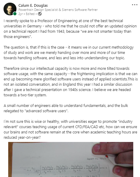
This post now has about 1.5 million views, and something like
1500 comments (some angry) on Linkedin if you can find it.
"glorified software users rather than applied scientists"

I'm sure it'll be *fine.*

have-you-tried-praying-to-the-machine-spirit.jpg


It's not like science fiction has ever warned us about humanity becoming dumb and technology getting out of our hands and becoming indecipherable magic to us. We as a species are *far* too ensmartened for that sort of thing.
 
Hi.

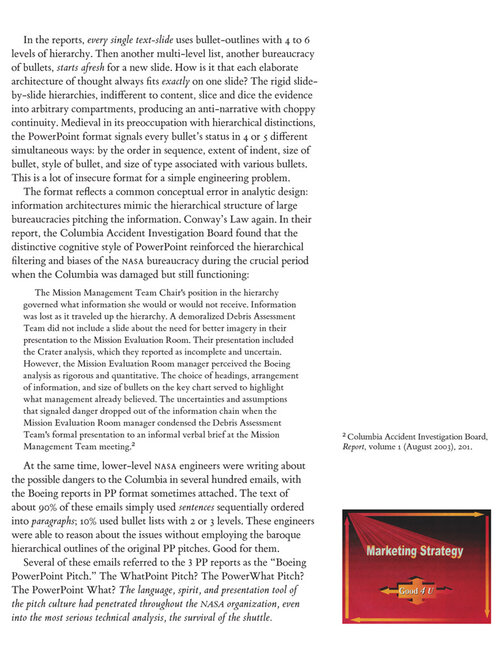
The most anti-powerpoint engineering-related, reference book was authored by Edward Tufte

Tufte is a world-renowned author in data science and master in the art of "visual understanding of information".
He was hired a a consultant to analyze Boeing's PPT slides after the 2003 Columbia accident investigation board.


His analysis of why powerpoint is a roadmap to disaster is both funny and very scarry.

Enjoy this sample material, and don't forget to pay a visit to Tufte's website: he self publishes his books, since no publishing company ever accepted to produce so (expensive, i.e. production intensive and quality perfect) books; then he started his own publishing company and his books have become classics.

A.
 

Attachments

  • 0001yB-2234.jpg
    0001yB-2234.jpg
    228.4 KB · Views: 48
  • 0001yB-2235.gif
    0001yB-2235.gif
    147.1 KB · Views: 48
  • 0001yB-2238.gif
    0001yB-2238.gif
    117.3 KB · Views: 42
  • 0001yB-2239.gif
    0001yB-2239.gif
    109.6 KB · Views: 40
  • 0001yB-2240.jpg
    0001yB-2240.jpg
    239.1 KB · Views: 36
  • 0001yB-2242.gif
    0001yB-2242.gif
    198.7 KB · Views: 35
Last edited:
I have been browsing through SAE Journal issues from the 1920s. The material is far, far more interesting and clearer than in modern comparable publications. The articles I have sampled have been written by people like Juan de la Cierva, Anthony Fokker, Luke Hobbs, George Mead, Charles Fayette Taylor, Arthur Nutt. All heavy hitters writing without the turgid jargon found in today's journals, yet with deep knowled

You shouldn’t compare a publication for a journal with an average Power point presentation. Power Point is just a tool and it only becomes dangerous if your everyday presentation shall have the same aesthetic quality like a publication in a renowned magazine.

If you are working in a team of about 10 people and you have to present the project status every 2 weeks, you should not invest half of your time to make beautiful presentations. This doesn’t mean aesthetics and a clear path in the presentation doesn’t matter, but its much better to do a top design and a mediocre presentation than the other way round. Imagine half of your design team were illustrators, secretaries, lectors and not engineers or draftsmen, this wouldnt work in smaller companies!
Like any other tool Powerpoint can be used for good or evil. ;)
 
I have been browsing through SAE Journal issues from the 1920s. The material is far, far more interesting and clearer than in modern comparable publications. The articles I have sampled have been written by people like Juan de la Cierva, Anthony Fokker, Luke Hobbs, George Mead, Charles Fayette Taylor, Arthur Nutt. All heavy hitters writing without the turgid jargon found in today's journals, yet with deep knowled

You shouldn’t compare a publication for a journal with an average Power point presentation. Power Point is just a tool and it only becomes dangerous if your everyday presentation shall have the same aesthetic quality like a publication in a renowned magazine.

If you are working in a team of about 10 people and you have to present the project status every 2 weeks, you should not invest half of your time to make beautiful presentations. This doesn’t mean aesthetics and a clear path in the presentation doesn’t matter, but its much better to do a top design and a mediocre presentation than the other way round. Imagine half of your design team were illustrators, secretaries, lectors and not engineers or draftsmen, this wouldnt work in smaller companies!

The problem is in presenting the data clearly or not. This includes:
- aesthetics: unreadable fonts, busy designs etc. detract from the information in the presentation
- data presentation: choosing the axes of your graphs correctly.
- setting priorities: if you have a series of 10 failure modes ranging from inconvenient to catastrophic, don't spend 90% of your time on the merely inconvenient ones

In the aftermath of the Challenger explosion, one of the causes was determined to be that the information had been presented badly:

Statistician and data visualization legend Edward Tufte argues in his book Visual Explanations that the engineers failed to communicate dangers because the data wasn't presented in an easily digestible form. Witness the two charts engineers used to describe the erosion of O-rings – the cause of the catastrophe – on the morning of the launch:
The typography was sloppy. Unnecessary icons of rockets obscured key numbers. Worst of all, the performance data of the O-rings was arranged by launch date, rather than by the critical factor, temperature. That, says Tufte, made it all but impossible for decision makers to envision that a launch in weather below 66 degrees probably would involve O-ring failure.

I have Tufte's book 'The visual display of quantitative information'. This is basically the definitive work on the subject. The general principles it outlines are simple:
- Keep the design simple. Remove everything that's not strictly necessary
- think about how you present the data: correct axes on a graph, cause on the horizontal axis, effect on the vertical. Choose units carefully. If your data ranges between 2 and 3, don't use a graph that has a vertical axis from 0 to 100.
 
Last edited:
I do not recall the past being that rosy either. The number of engineers who create appalling failures has always vastly outnumbered the ones who design successful engines, aeroplanes, or anything else for that matter.
It used to be said that them as can do, them as can't teach.
Nowadays, them as can't write dumbed-down powerpoints.
 
I believe, most of the criticism has little to do with power point, some would like to have interesting hand drawings from the illustrators back which were a kind of art, some prefer a written report instead of a presentation. We want find a better alternative, where everyone agrees to.

From my personal view, if I e.g., have to present our company at a customer, I couldn’t do it with a written report, so I need a presentation. I might use a movie additionally, but professional movies are expensive and aging fast, also they tend to be annoying and block every conservation. For documentation the status of a project and the ongoing design changes, a short presentation with CAD screenshots is the easiest and most understandable way. Nobody wants to read a long report every two weeks. I do agree, that some 3d parts can spice up every presence meeting, something which gets lost in all the online meetings.

It depends on what you’re doing, there are other presentation programs, which might be better or not, but the idea of presenting your stuff in a graphic way will remain. At the university I always preferred Profs using Power Point over Profs doing unreadable hand writings on a projector.
 
While not comparing the old journals to PP directly, it is worth noting that many articles in those SAE Journals were presentations held at various SAE symposia. Being a student (though in business administration) in the first half of the 2010s, I would say that presenting such in-depth views via PP would have been very difficult. PP is suitable for a very lightweight stuff only.
 
If been to some conferences and even hold a presentation on a conference myself (Aufladetechnische Konferenz) , you need to put graphic stuff on the screen and explain the context freely. I’m sure, it was quite similar in the old days, despite using over head projectors and black and white graphics.

Of course, for the conference book, you need to write a text document with all the graphics and can’t simply stuff the power point presentation in it. There’s not so much, what has changed, just the graphics are better today…
 
Of course, for the conference book, you need to write a text document with all the graphics and can’t simply stuff the power point presentation in it. There’s not so much, what has changed, just the graphics are better today…
I get lots of shoddy course material that is just that - hard/electronic copy of a powerpoint presentation. Glad to read conferences set higher standards for documentation.
 
The Tufte article quoted by @antigravite is very, very interesting. It brings a new slant to "Death by PowerPoint" and crystalised my dislike of it. In the same way that "Every tool can be used as a hammer", it's not PowerPoint that's at fault, it's using it for the wrong purpose that is actually dangerous.
 
Not Powerpoint, as the problem preceded it by a few years, but seems somehow relevant:


The factors that contributed to the failure of the Vasa ship are plentiful:


1. Unreasonable time pressure
2. Changing specifications and lack of documentation or project plan
3. Over-engineering and innovation
4. Lack of scientific methods and reasoning
 

Please donate to support the forum.

Back
Top Bottom