Have design trends gone way too overboard with the "Stealth" look?

X-39

To post or not to post, that is the question
Joined
20 February 2021
Messages
382
Reaction score
913
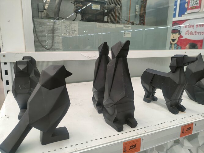
Hi. There is this thing that i did not really mind when i was younger, but now it bothers me, A LOT. I'm talking about the overused edgy, "Gamer"/"Stealthy" aesthetic trend that for the last 10 years or so has dictated the appearance of many everyday objects, that went from "normal" to abortions that look like Transformers meets Stealth Aircraft meets Hot Wheels meets Max Steel , that (in my opinion) just unnecessarily makes them TACKY and UGLY. Let's begin with the breakdown:

We have Stealthy looking cellphones:
5f1556a9521c09342e9814ce-large.jpg


What's the reason behind this F-117 inspired fridge?
enfriador-criotec-cfx-08-2.jpg


Car stereos too:
KDC-BT32U_SWL.jpg


Don't even get me started on these hideous "Hi-Fi" systems:
solbtgpx77.jpg


Avalon Teseract, a High End Sound System, in this case the edgy design is actually justified as the facets bounce the soundwaves in certain ways to make the speakers "disappear" from the room:
Avalon+Acoustics+Tesseract+2.jpg

Screenshot 2022-04-01 at 20-43-19 Avalon Acoustics Tesseract Floorstanding Loudspeakers Home M...png

Fighter inspired Supercars had to be included in the list, hahaha... look at this abomination!
Lamborghini-Egoista-7.jpg


Aaand of course, Stealth Gaming Hardware:
vladsavov01_03_1056v17.0.0.jpeg

7XZUkAiCqpCyiJrHXyDchg-970-80.png.webp


At first sight these two, (the first one being a homebuilt case) could very well belong to the same family:
88.jpg

Unique-pc-case.webp

 
Excuse me while I put on my propellor hat...

The Vertu cellphones were a collaboration with Bentley as part of an extended range of lifestyle products that many car manufacturers produce these days (another trend that's gone berserk). The peaked shape is meant to recall the classic Bentley radiator grille.

But yeah.

You're not alone. Here's former BMW designer Frank Stephenson eviscerating a new BMW design. Warning: it is not just a concept car! They are actually going to manufacture it. Disguised prototypes have been seen testing. Undisguised ones may appear in your vision soon!

View: https://www.youtube.com/watch?v=Q0JXN__wX_A&t=2s&ab_channel=FrankStephenson


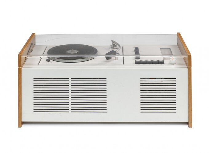
For relief, here's a record player by Dieter Rams. It's nice and logical.
 

Attachments

  • 08_foto_andreas_satterlin.jpg
    08_foto_andreas_satterlin.jpg
    294.9 KB · Views: 14
Last edited:
I have to agree with him. Rather sad truth be told.
 
I cause consternation each time I haul out my tiny clam-shell flip-phone. It is so simple, so basic, so generic, it looks and feels like a child's $_1 toy.

Happens it is but a 'burner', has one (1) stored number, the local taxi service with which we've a 'priority' account...

D'uh, there's another reason for its simplicity: Smart phones die when I handle them. I'm still 'non grata' in several of our local budget mall's phone-shops after accidentally 'bricking' a succession of their demo models. Yes, such is supposed to be impossible but, in my hapless hands, those too-clever phones promptly went 'Blue Parrot'...

FWIW, I'm no IT-Luddite: This 'Desk With No Bars' has three 19" wide and one 17" portrait for my CAD_Tower, plus a 14" VGA hung off the end for my network-render 'Box'...
 
Has there ever been a fad companies didn't jump on to sell junk? Look at all the fins and fairings on cars when the "Jet Age" started (50s/60s)
 
Has there ever been a fad companies didn't jump on to sell junk? Look at all the fins and fairings on cars when the "Jet Age" started (50s/60s)
Not to mention the *current* fads that companies as stunning and brave as Disney and Gillette have leaped onto. A sales fad doesn't need to involve actual product design, but in how it's sold.

But as far as bad/weird product design, it's really hard to compete with the 70's.

1978-01-b.jpg
 
Macho macho man, i want to be a macho man. I can just here this song playing in the background.
 
FWIW, I'm no IT-Luddite: This 'Desk With No Bars' has three 19" wide and one 17" portrait for my CAD_Tower, plus a 14" VGA hung off the end for my network-render 'Box'...
19 inch monitors? 14 inch VGA? Which century do you live in, man?
 
Funnily enough, my five feet of screen width is an excellent match to the stuff I do. A single, sorta-square mega-screen would have umpteen overlapping windows, all tripping over each other, and no shelf above for the three printers...

restu01_0030.jpg

"The fish is off..."
 
Another of my pet hates in current car styling: enormous grilles, which are even put on EVs. Apparently the Chinese market sees them as marks of prestige. Their only rationales I can imagine are that alternative fuels now include plankton, or SUVs can go so far off road that they venture into the deep sea.
 

Attachments

  • 1-audi-q8-2018-fd-hero-front.jpg
    1-audi-q8-2018-fd-hero-front.jpg
    103.8 KB · Views: 8
  • Cetorhinus_maximus_by_greg_skomal.jpg
    Cetorhinus_maximus_by_greg_skomal.jpg
    2.6 MB · Views: 8
  • 29SCI-ANGLERFISH-promo-videoSixteenByNineJumbo1600.jpg
    29SCI-ANGLERFISH-promo-videoSixteenByNineJumbo1600.jpg
    467.5 KB · Views: 8
Last edited:
Hehe, could get a rabbit one and label it Project Harvey (although that was a blended design) ;)
 
Does anyone go into a shop and say "Excuse me, where are the 'lifestyle products'?" That sort of word manipulation makes me sick.

So, here are the three rules for design: Make sure it doesn't look like the old stuff! Translation: If they do a movie about the early 2000s, they will need designs from the early 2000s.

Rule 2: Word manipulation: Just move some words around, create stupid terms, and the current trend: Drop some vowels. So Live becomes Liv, and Berserker becomes BRSRKR. Modern, right? Again, I get that queasy feeling in my stomach.

Rule 3: Add color, all over the place, on anything. If you think it doesn't look like it belongs: Too bad. It just means you don't know what "" modern "" is.
 

Please donate to support the forum.

Back
Top Bottom