Default Forum Style (Light or Dark)

What should be the default style?

  • SPF Light Style

    Votes: 26 78.8%
  • SPF Dark Style

    Votes: 3 9.1%
  • SPF Dark 2.0 Style

    Votes: 4 12.1%

  • Total voters
    33

overscan (PaulMM)

Administrator
Staff member
Joined
27 December 2005
Messages
16,914
Reaction score
21,737
Hi all - after the recent upgrade, I've swapped the default look from the "SPF Light" white and blue style to "SPF Dark 2.0" grey and blak style.

The reason for this is primarily that more and more devices and sites are going dark to save on battery life. I disliked it myself at first, but now prefer it.
 
Light has been the standard for me up until a few months ago, and I think it gives newcomers a warm inviting welcome. I do love the new 2.0 style though!
 
I prefer Light and voted accordingly.

If it turns out that the majority prefers Black then please consider to add an additional Paintbrush button at the top of the page as well.
 
Agnostic on this. I prefer light, the switch at the bottom of the page is easy to use - as long as the choice is offered, whichever is the default is immaterial to me. SPF works fine with light and dark styles. Well done.
 
Yes, i don't have a strong opinion on the topic, but having the button easily accessible is an excellent solution.
 
Definitely a light fan. I did a quick search to check on accessibility and apparently it's mostly six and two threes between light and dark, but people who are colour-blind will struggle with dark in some circumstances. Interestingly the article I read claims the battery life issue is only significant for OLED and AMOLED screens.


Personally I'd tuck the selector top right for immediate visibility, possibly just to the right of the search icon. Given the length of some pages, putting it at the bottom is potentially a lot of scrolling away and people may never notice - I found the post telling me how to change before I ever noticed the icon.
 
I think this is an open & shut case for the light theme. Irrespective of personal preferences, the dominant visual design language these days is lots of white (Google, Apple, Amazon). That’s what people are used to. So you’d need a very good reason to deviate. (And I work every day with techies, who do prefer dark)
 
I'm fine with the present choice. It isn't too hard to change it to one's convenience.
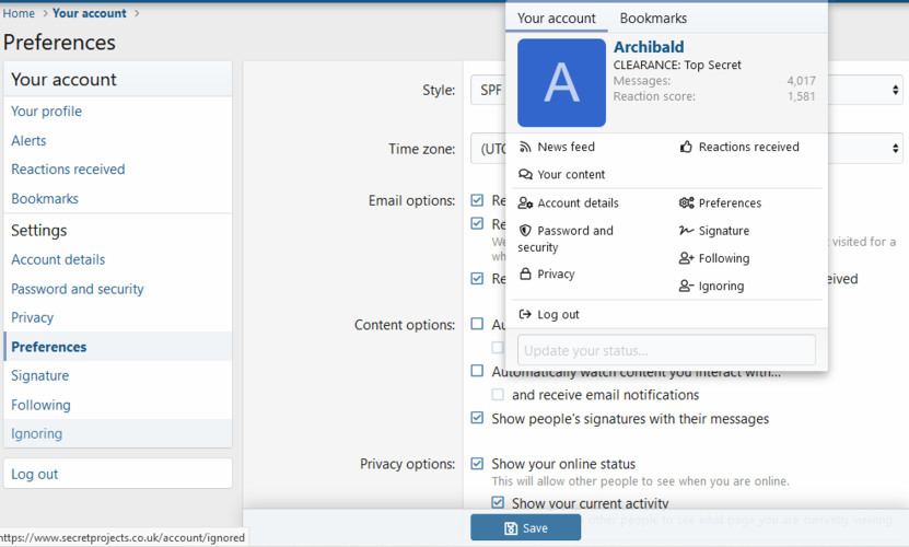
Your account > preferences > style:


Capture.PNG
 

Similar threads

Please donate to support the forum.

Back
Top Bottom